Logotype design for Bizlinx
The following artwork is a creative logo designed for Bizlinx, a Swedish business development agency located in Lund, which aims to assist innovative enterprises achieve growth in the United States or Nordic markets. They enhance business-to-business and business-to-consumer interactions, and support their clients to establish strong business connections.
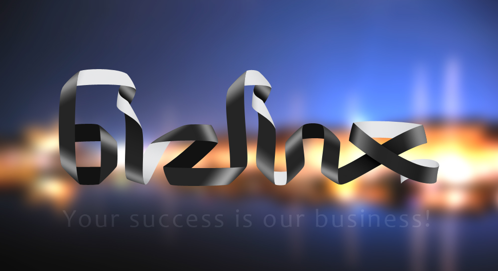
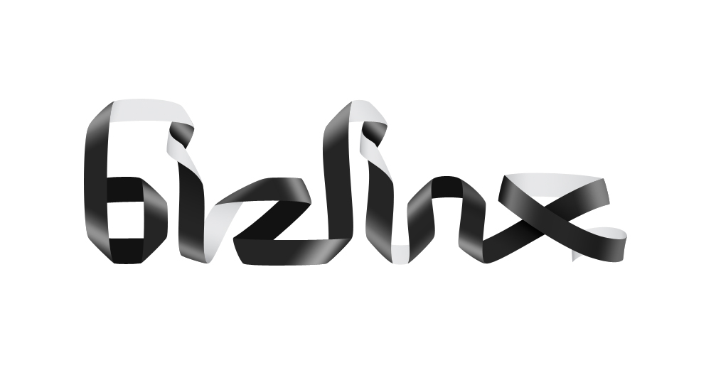
In the design of this project, we have tried to visually communicate the main focus of the company, which is linking businesses together, or linking businesses to new markets. This is the very same idea that is smartly applied in the name-choice of the company, ‘Bizlinx’; which is driven from two words of Business + Links. The name is nicely chosen to provide the audience with a simple and joyful discovery of the meaning. Such a playful discovery would make the audience happy, and helps the name to be easily remembered; and that is the reason why we chose to design a playful visual puzzle for the playful verbal one!
The logotype is creatively designed in a way that all the letters are linked together. This long twisted ribbon-like form, not only highlights the verbal meaning, but also connotes the long and difficult path which any company should undergo to reach new markets or financial success. While Bizlinx makes such a complicated way, easy, smooth, and very short. Visit Bizlinx official website, also designed by Tiny Little Monsters.
