
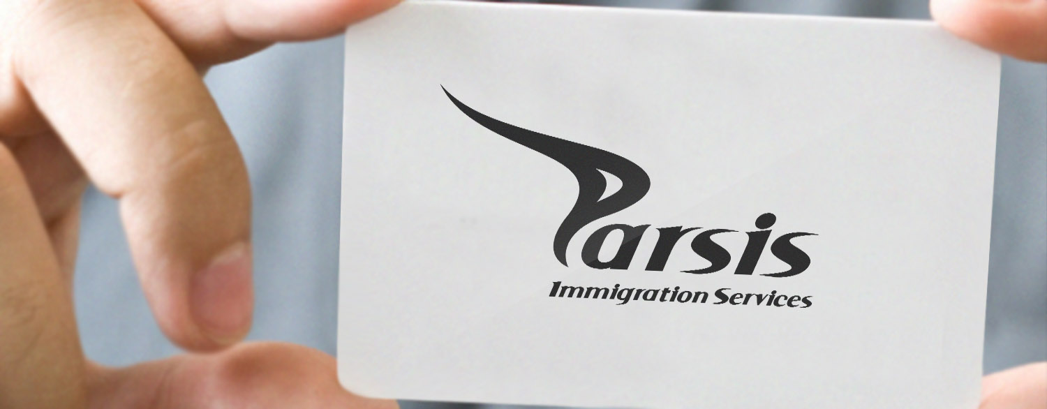
Logotype design for Parsis Immigration Services
The following work is a logotype designed for Parsis Immigration Services, which is a Canadian company located in Montréal, Quebec. Parsis is involved with a variety of services related to immigration, and traveling to Canada. They provide consultation and professional help to people who need to immigrate or achieve any form of Canadian visa, such as tourist visas, or student visas.
Parsis’s professional working branch and the concept behind the immigration and travelling overseas, had a crucial role in the design of their logotype. Since the notion of immigration or traveling to such country first of all calls to mind flying, therefore representing a motif related to flight or flying was the major of choice. Moreover, the logotype was supposed to denote an inviting and welcoming feeling; both because of the nature of immigration which is tough in itself, and also because of the importance of attracting the right audience.
In addition, another important element in design was creating a unique logotype that represents the full name of the company, which can imprint it mind, and be remembered easier later. Therefore, a smoothly curved wing-shaped “P” was created, which plays an important role in formation of the rest of logotype. The wing shape reminds of flying and immigrating, and its stretched shape calls to mind notions such as freedom, motion, flow, and a pleasant movement towards future.
Form of the “P” character influenced the typography of this work. We tried to keep the same flow in the rest of the letters, while avoid skewing and transforming them to such scale that makes the logotype unreadable.
The result was a successful logotype, that improves Parsis’s professional corporate image, and plays an important role in the rest of their corporate identity design.